Practical branding for Europe’s commercial vehicle specialist.
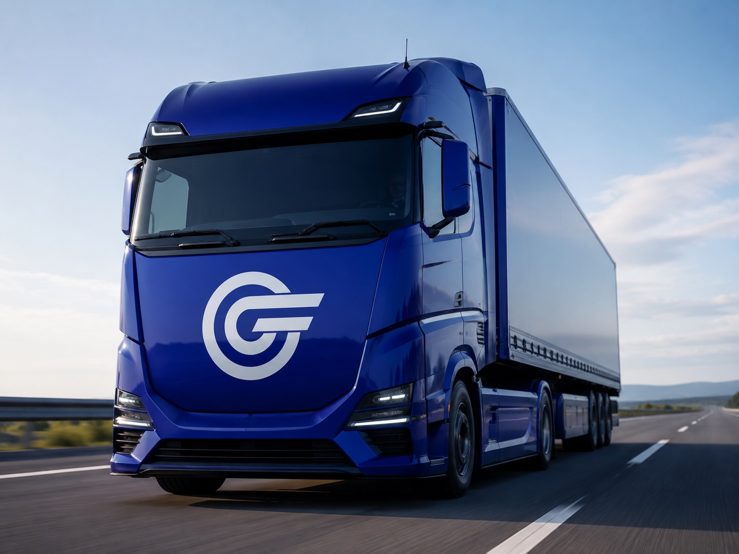
Make a fleet brand feel premium in a functional industry.
Greiwing Truck & Trailer competes in a category built on specs, not stories — rental terms, axle counts, service intervals. The previous identity did nothing to set the company apart from any other fleet operator on the Autobahn.
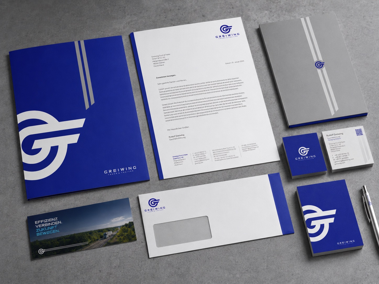
We were asked for a Corporate Design that could carry real commercial weight: legible at speed on the side of a 40-tonne trailer, credible in a boardroom sales deck, and consistent enough to be applied by teams across rental, leasing and logistics without a designer in the room.
A mark built to move.
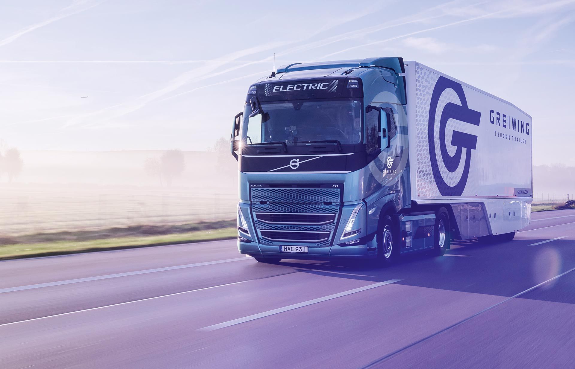
The new logo locks the initials of Greiwing Truck & Trailer into a single continuous form that reads as a wheel in motion — confident at billboard scale, still legible at the size of a business card.
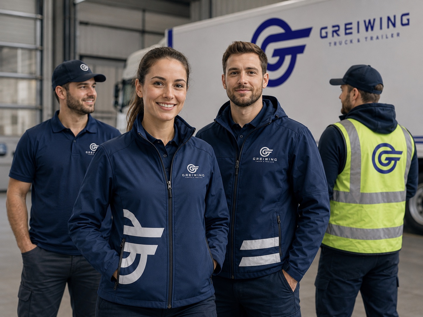
Greiwing Blue anchors the palette, paired with gray and a lighter accent reserved for calls to action. Applied to the fleet itself, the mark turns every truck on the road into a moving advertisement.


One manual, every application.
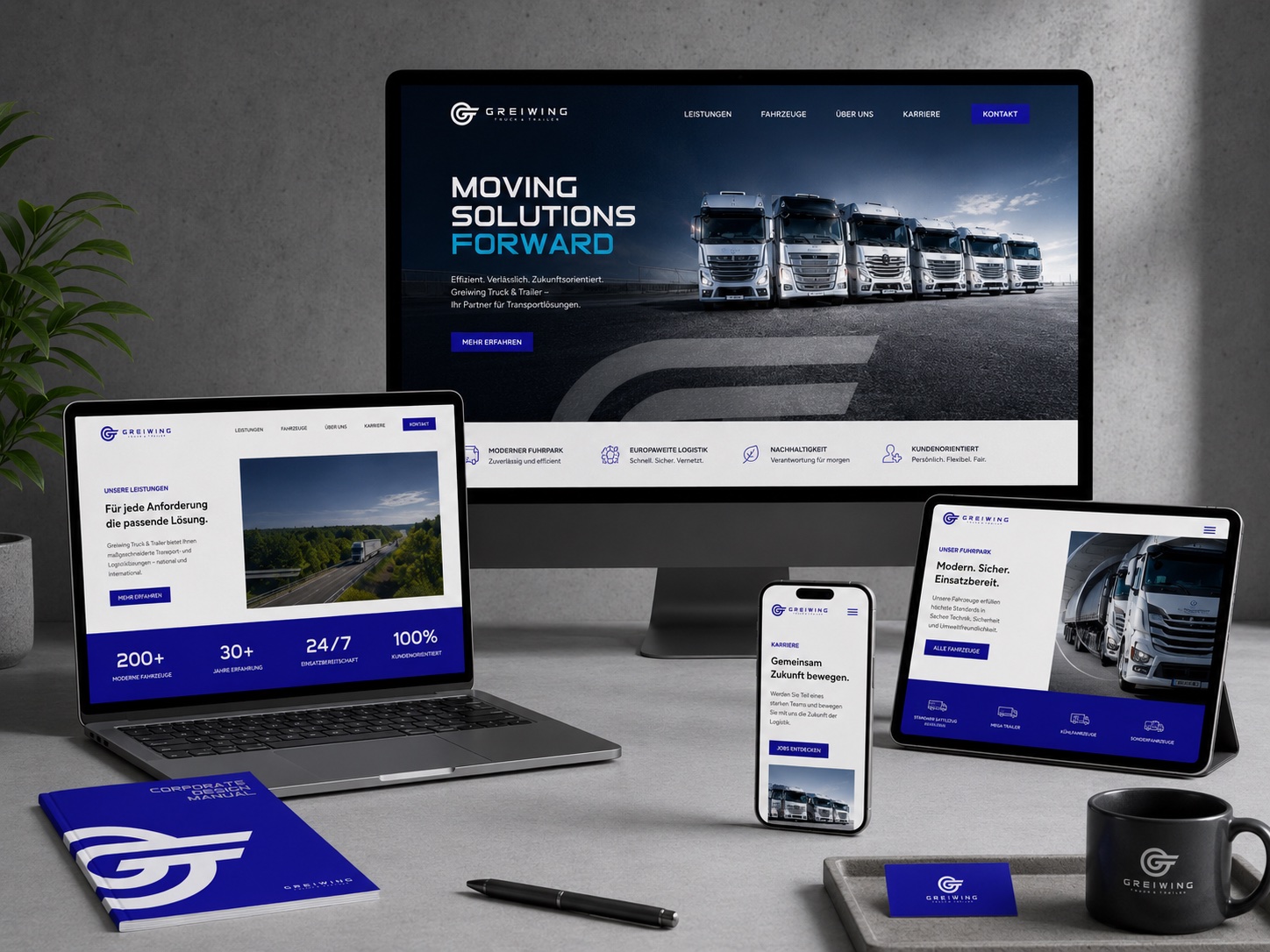
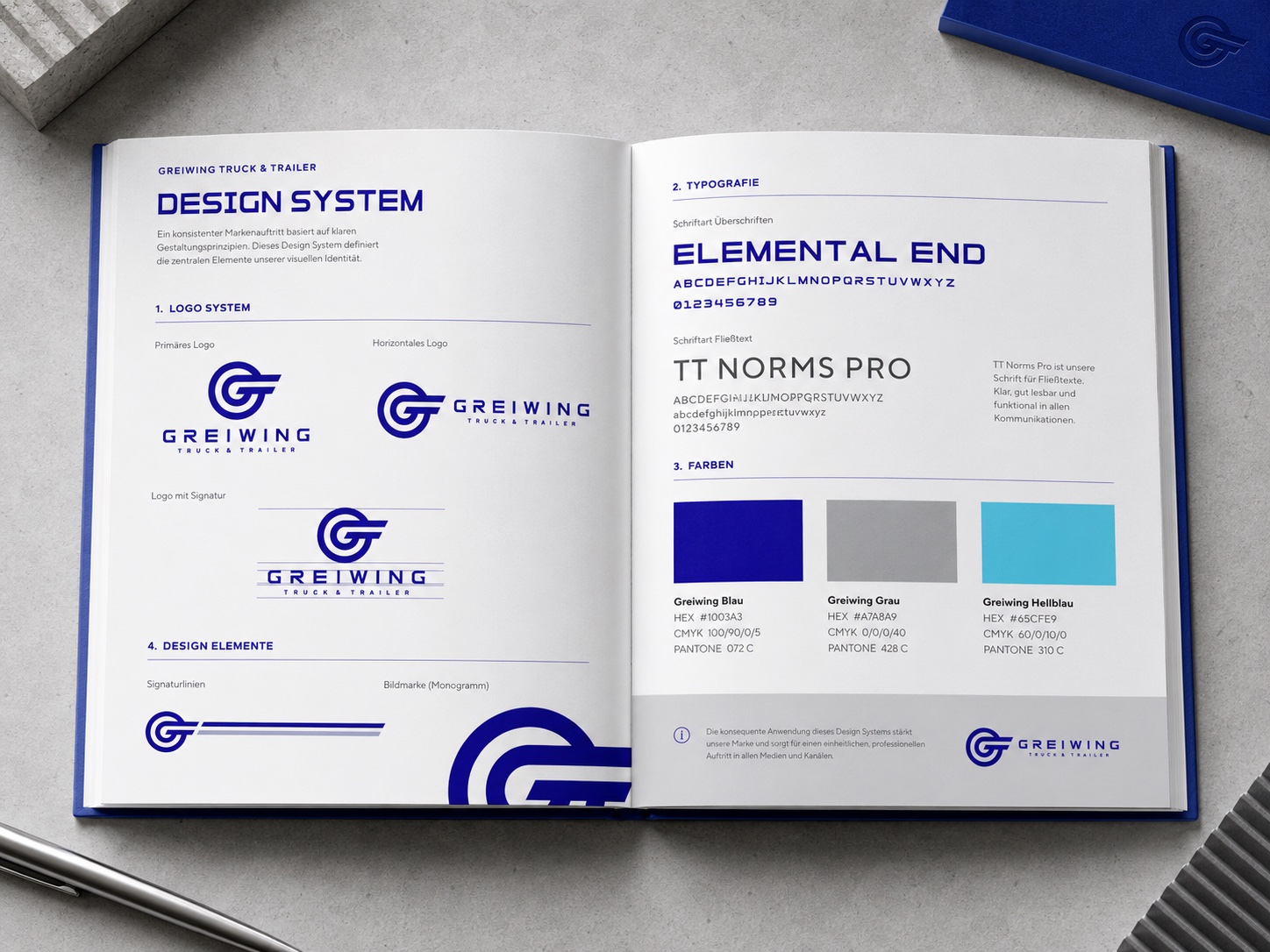
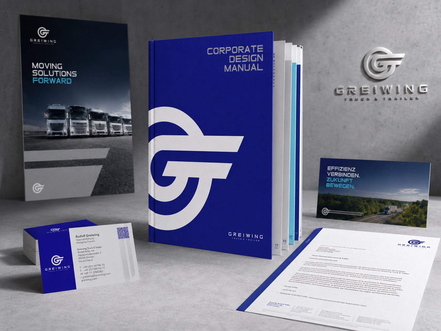
A full Corporate Design Manual documents the logo, clear space, typography and color system down to Pantone and CMYK values, so the identity survives contact with print shops, sign vendors and internal marketing teams across Europe.
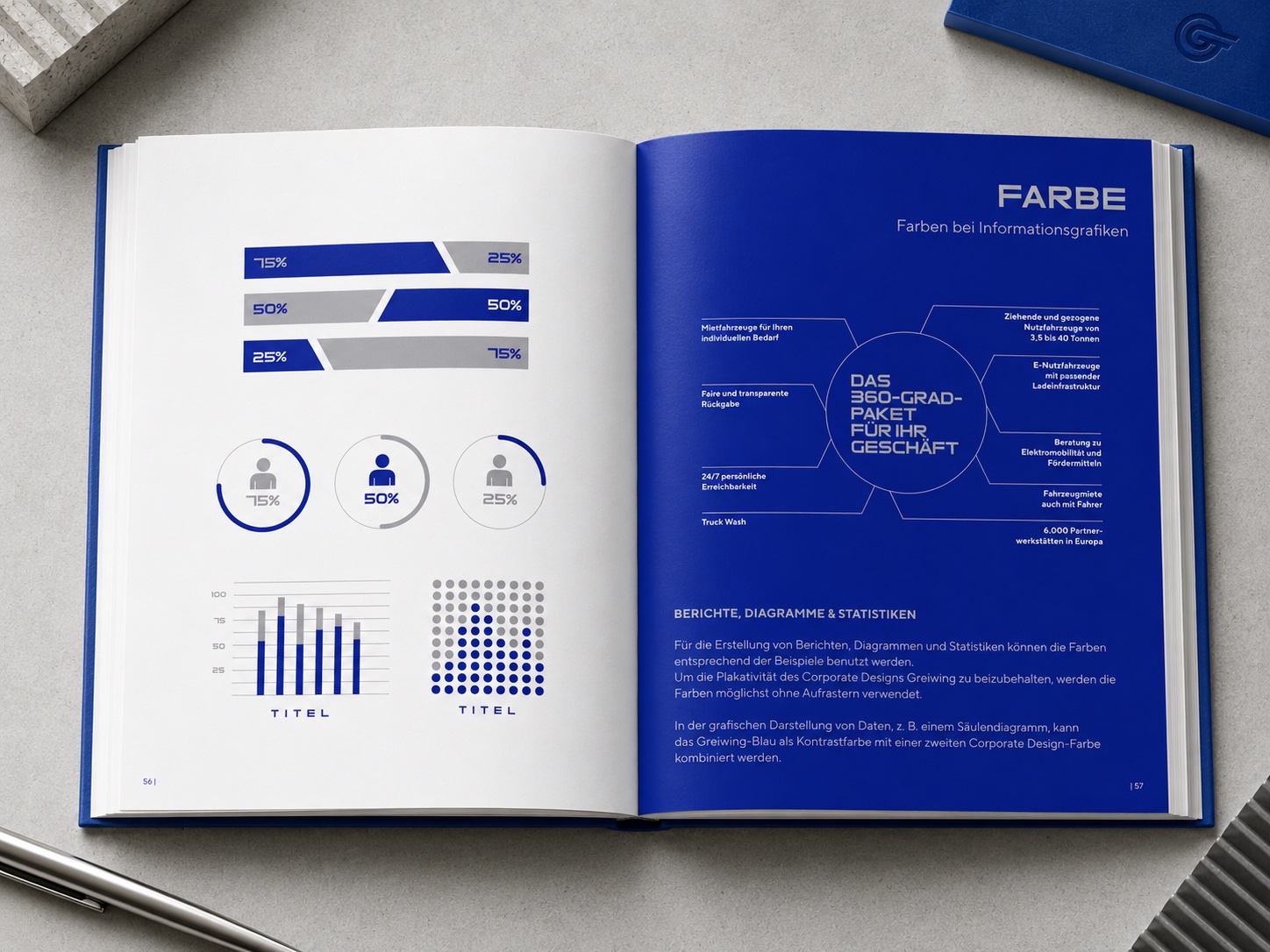
Elemental End carries display type; TT Norms Pro handles body copy. A dedicated infographic system keeps reports and sales decks on-brand without a designer redrawing every chart.

From the depot to the homepage.
- Website design
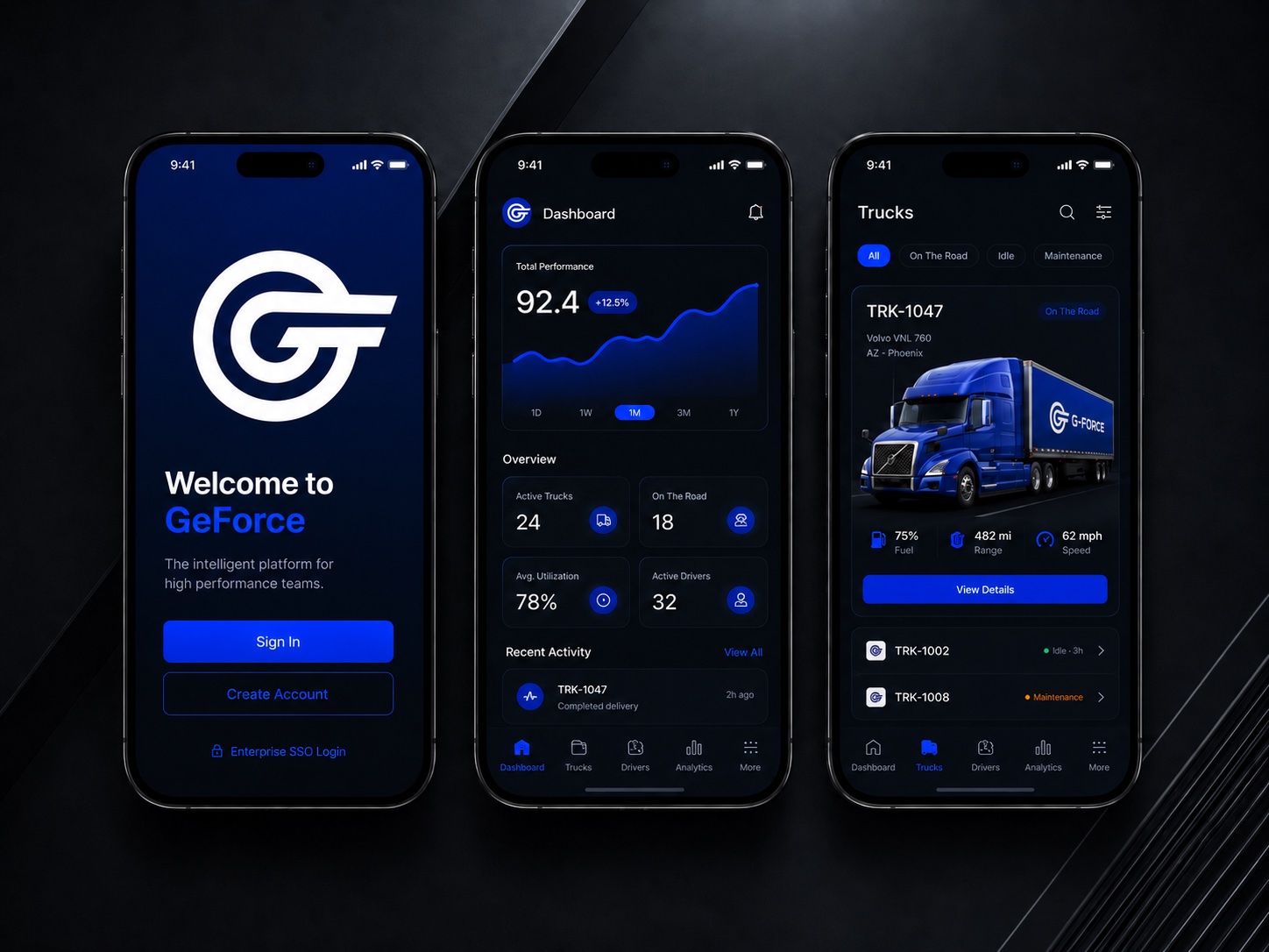
- Fleet app concept
- App icon & UI moodboard
- Fleet & trailer livery
- Warehouse & signage
- Team workwear
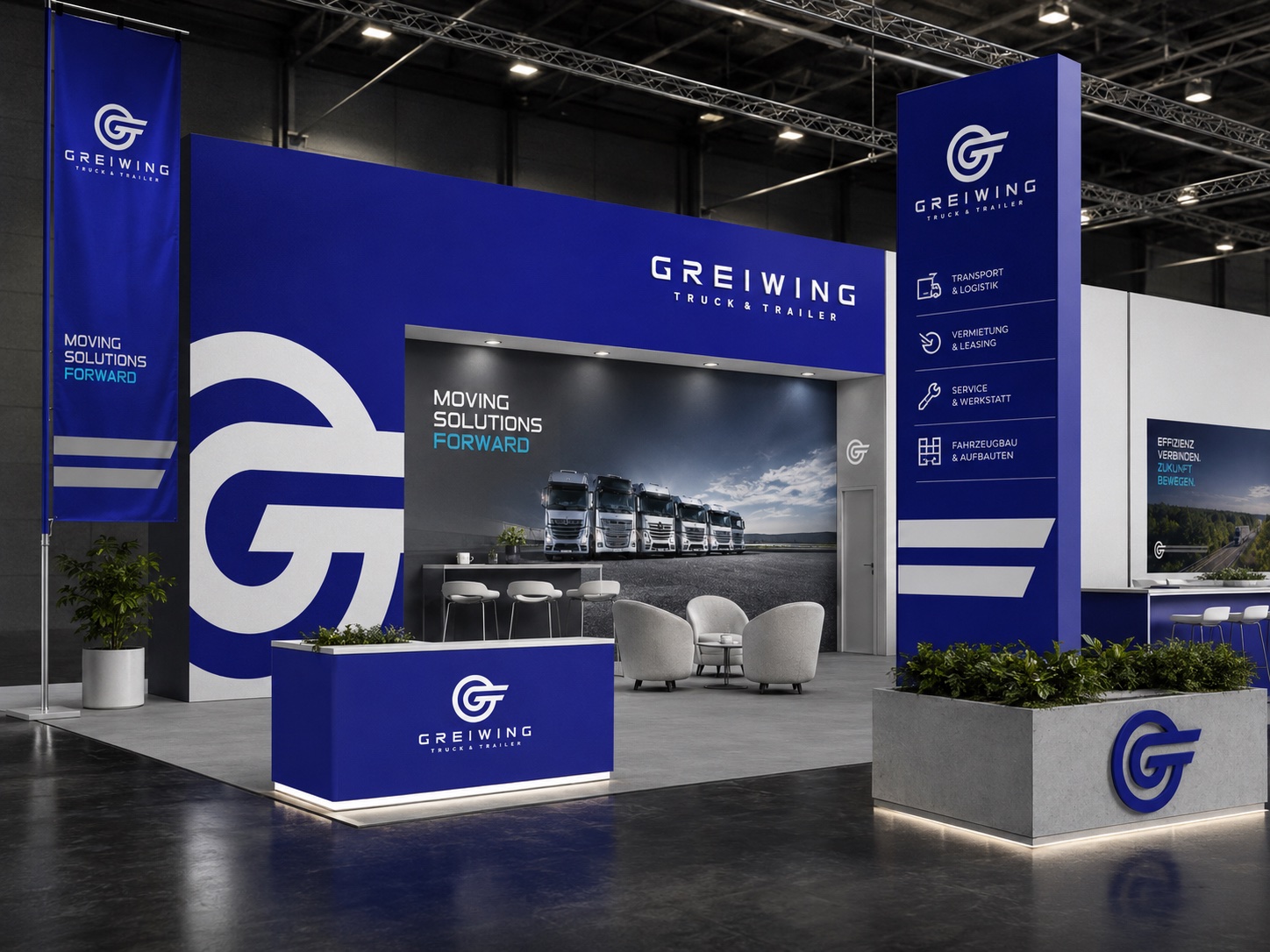
- Trade show booth
- Outdoor campaign
- Stationery system
- Sales & brand collateral