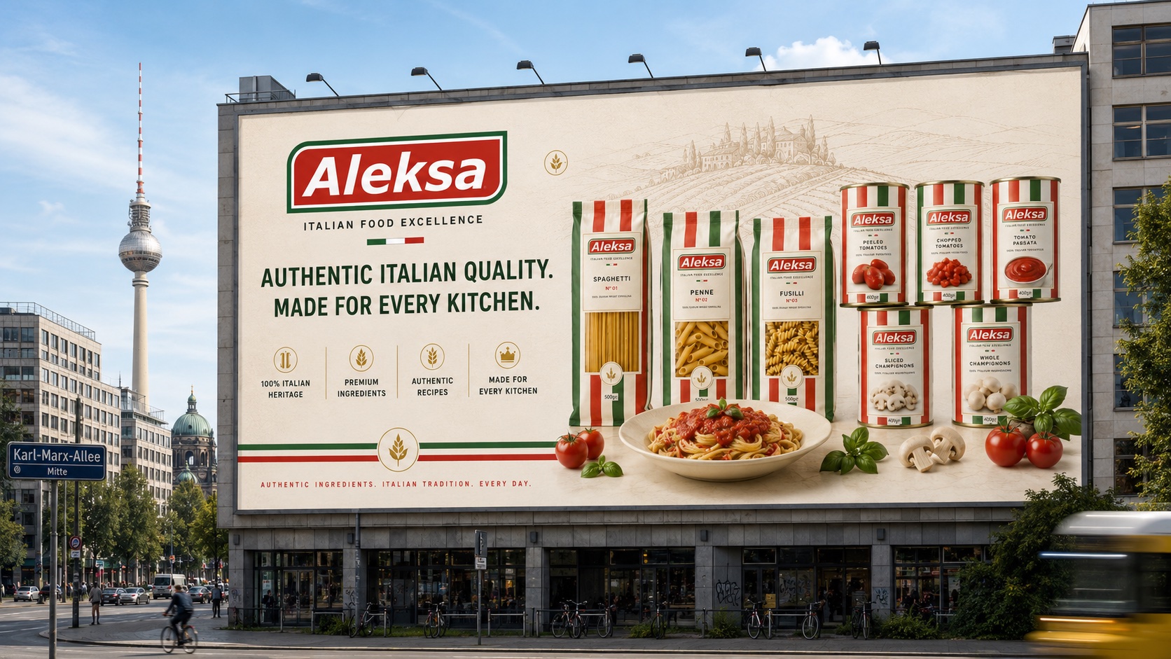
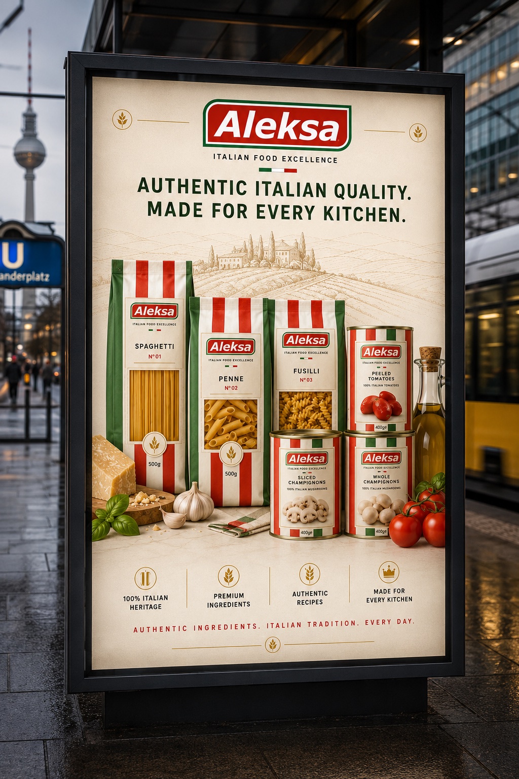
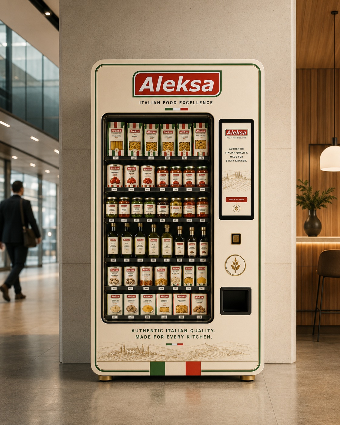
Italian gourmet food culture, reimagined for Berlin.

Make a gourmet brand feel authentic in a crowded deli aisle.
Aleksa is an Italian gourmet food brand entering Berlin’s retail and food scene — pasta, canned tomatoes and pantry staples in a category where every shelf is loud with heritage claims and gold foil. Without a distinct system, the brand risked reading as generic Italian, not authentically Aleksa.
We were asked for a brand identity that could carry real shelf presence: recognizable at a glance in a crowded deli aisle, credible enough for a storefront and editorial feature, and warm enough to feel like a discovery rather than a product line.
Authentic Italian quality, elevated Berlin attitude.
The identity uses classic Italian color cues, premium gold details and crisp type to create a brand that feels both heritage-driven and contemporary. Vertical Italian stripes and structured white fields carry across packaging, storefront and campaign so every touchpoint reads as one brand.
The system blends a bold grocery-inspired logo with an elegant headline typeface and warm food photography — premium without losing the approachable character of a modern gourmet brand.

One system, every touchpoint.
A full brand guideline documents the logo, packaging system, color palette and typography, so the identity holds together across packaging runs, print shops and social content without a designer redrawing every asset.
The system extends to uniforms, merch, stationery and digital assets, so every customer touchpoint — on the shelf or on screen — carries the same premium, unmistakably Aleksa tone.

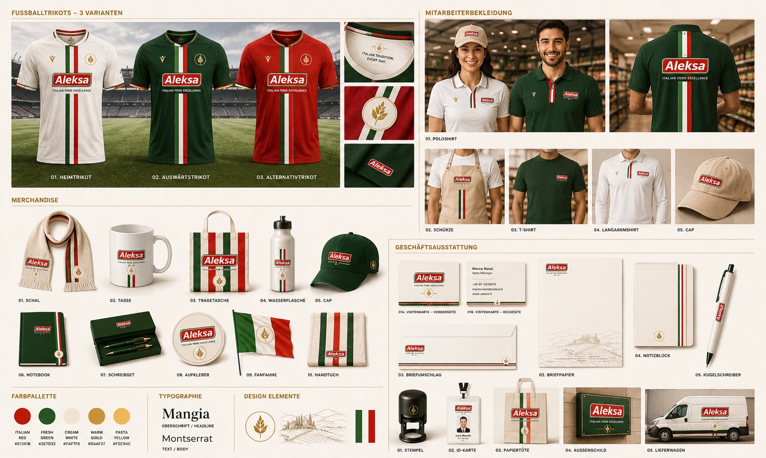
From the pantry shelf to the storefront.
- Packaging design
- Label system
- Storefront branding
- Out-of-home advertising
- Digital & website design
- Merchandise & uniforms
- Stationery system
- Brand guidelines
- Sports sponsorship